


Click or tap anywhere to close.
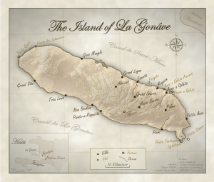
This map was produced for Dr. Mary Kimsey at James Madison University for a publication about La Gonave. The map was designed to look old-fashioned and classical, so a number of interesting design choices were made such as the the monochromatic color scheme, vignette effect, the handwriting font, the flashy north arrow and the background texture.
Click or tap anywhere to close.
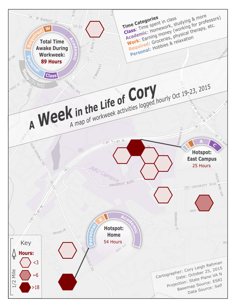
For one full workweek during school (Monday-Friday) I recorded my coordinates and what I was doing every hour for a total of 120 data points. The red hexbins in this map represent where I spent my time throughout the week. My activities were broken down into 5 categories listed in the upper-right corner of the map. The doughnut chart in the upper-left shows my activity breakdown for the entire week, while the two lower half-doughnut charts show activity breakdowns for my two biggest time hotspots.
Click or tap anywhere to close.

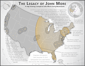
This map was created for the John More Association, a geneological group dedicated to tracking the descendants of John and Betty More, two Scottish immigrants in the late 1700s. The map shows a sample of current descendants and their correlation with John and Betty More's original settlement point. Due to the intended audience, several design choices were made including the omission of a traditional legend in favor of a more textual approach. The purpose of this map was to incite interest and show some simple analyses we can do with spatio-geneological data.
Click or tap anywhere to close.
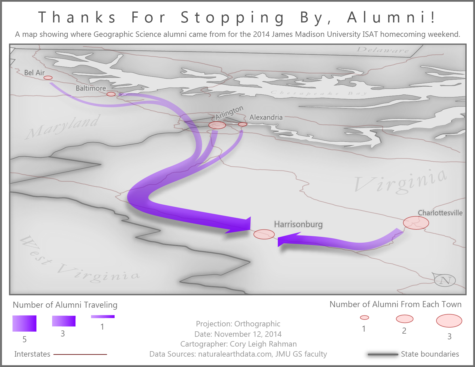
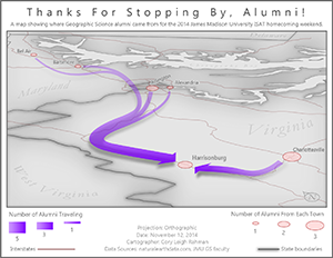
This is a flow map showing the movement of a handful of alumni who attended James Madison University's 2014 ISAT homecoming weekend. Proportional symbology was used both in the form of city circles as well as flow line thickness, and an oblique view was chosen in order to liven up the map.
Click or tap anywhere to close.
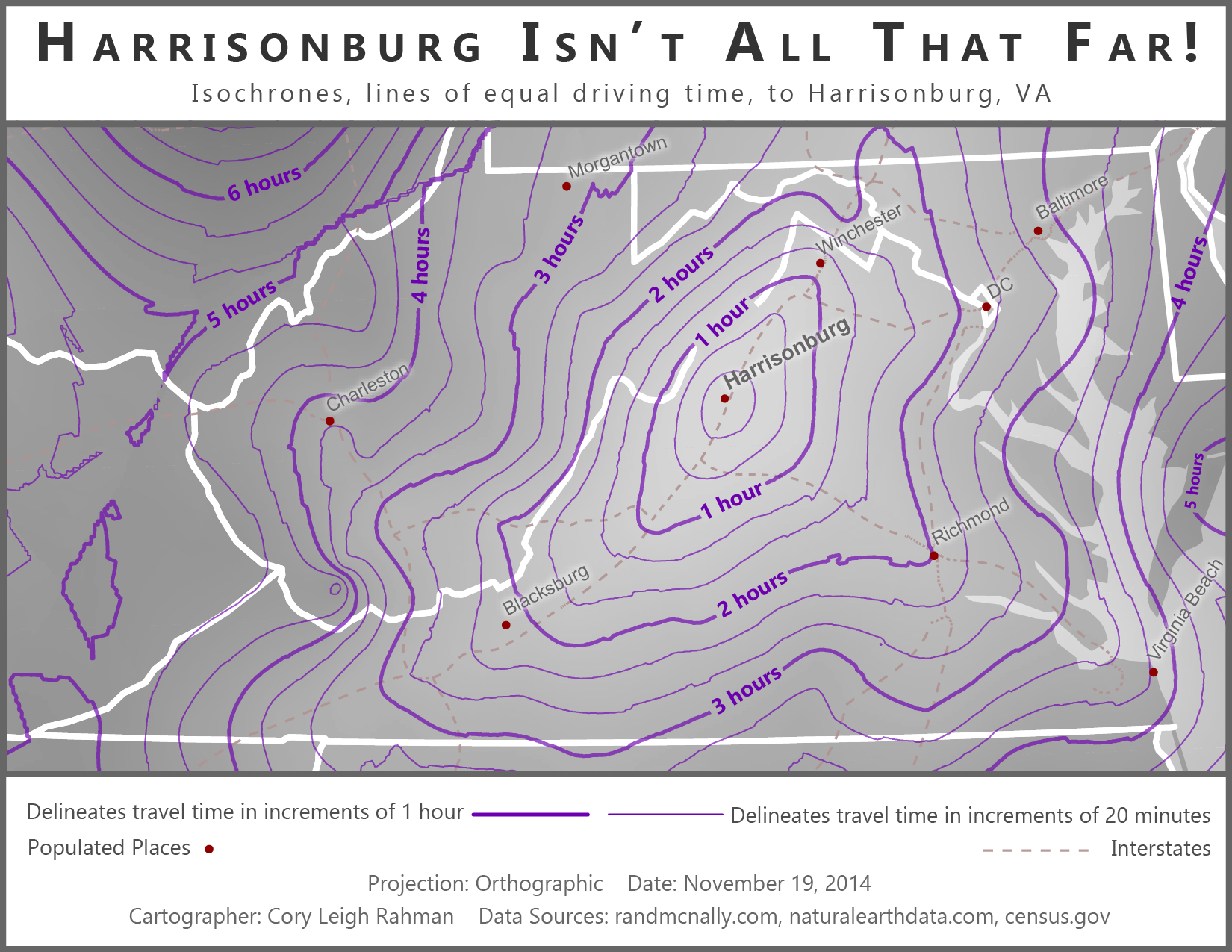
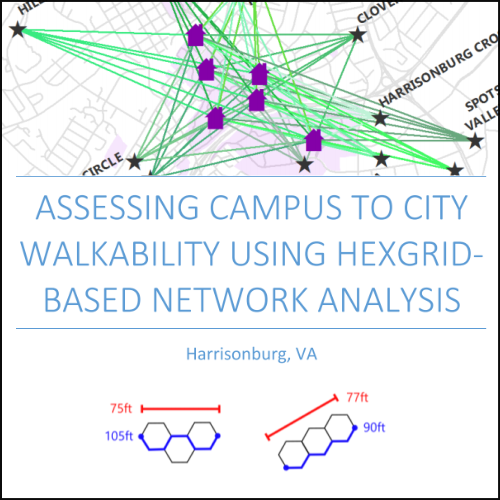
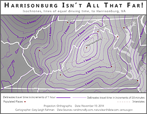
This is an isochrone map that shows lines of equal driving time to Harrisonburg, VA. The contour layer was created by interpolating point data with a drive-time attribute, then generating contour lines from the resulting raster.
Click or tap anywhere to close.
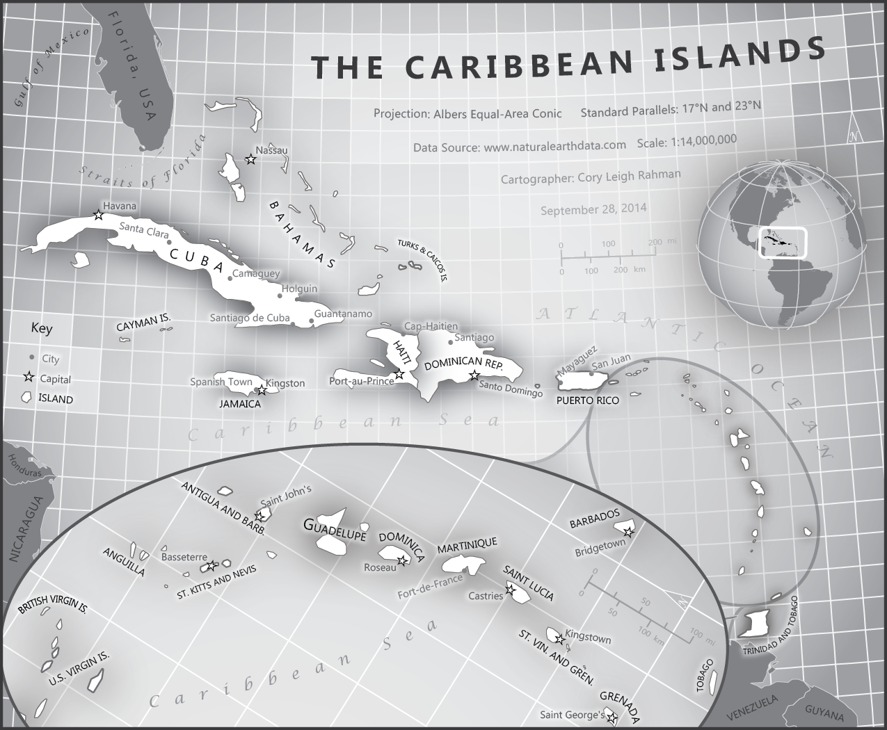
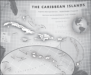
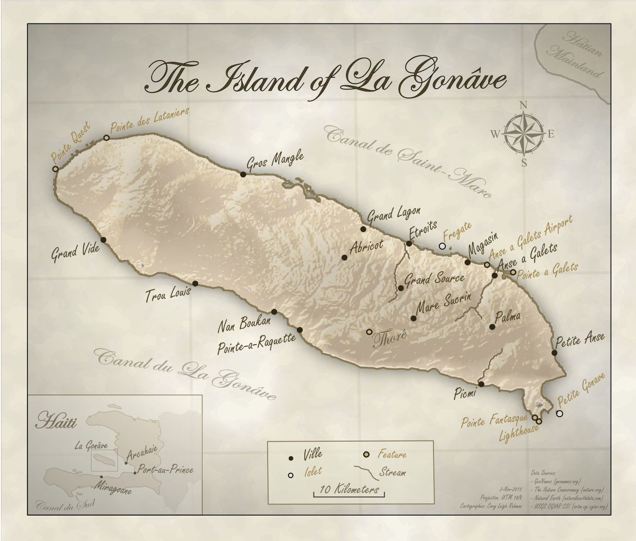
As one of my first styled reference maps, this remains one of my favorites. The map mixes old and new stylistic choices, all while retaining a simple monochromatic color scheme which is easy and cheap to print. Map elements such as the title, legend, and north arrow are intertwined in the graticules, while drop shadows boost the visual hierarchy of the islands.
Click or tap anywhere to close.

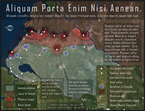
As a work of fiction, this map was designed to be used in an experiment of visual communication. The borders and land are entirely fabricated, and the text is a fake language (Lorem ipsum). Participants are meant to syphon meaning from only the cartography, not the text or any pre-existing geographic knowledge. Can you figure out what this map is trying to portray?
Additional information: Sensationalist maps like this one are usually eye-catching and generally contain more data and a lot of supplementary information in order to excite the reader and overwhelm them into supporting the map’s purpose. In the map you see here, most of the supplementary information is in the form of text boxes, but often sensationalist-styled maps have graphs, charts, text boxes and a whole lot more spatial data.
Click or tap anywhere to close.
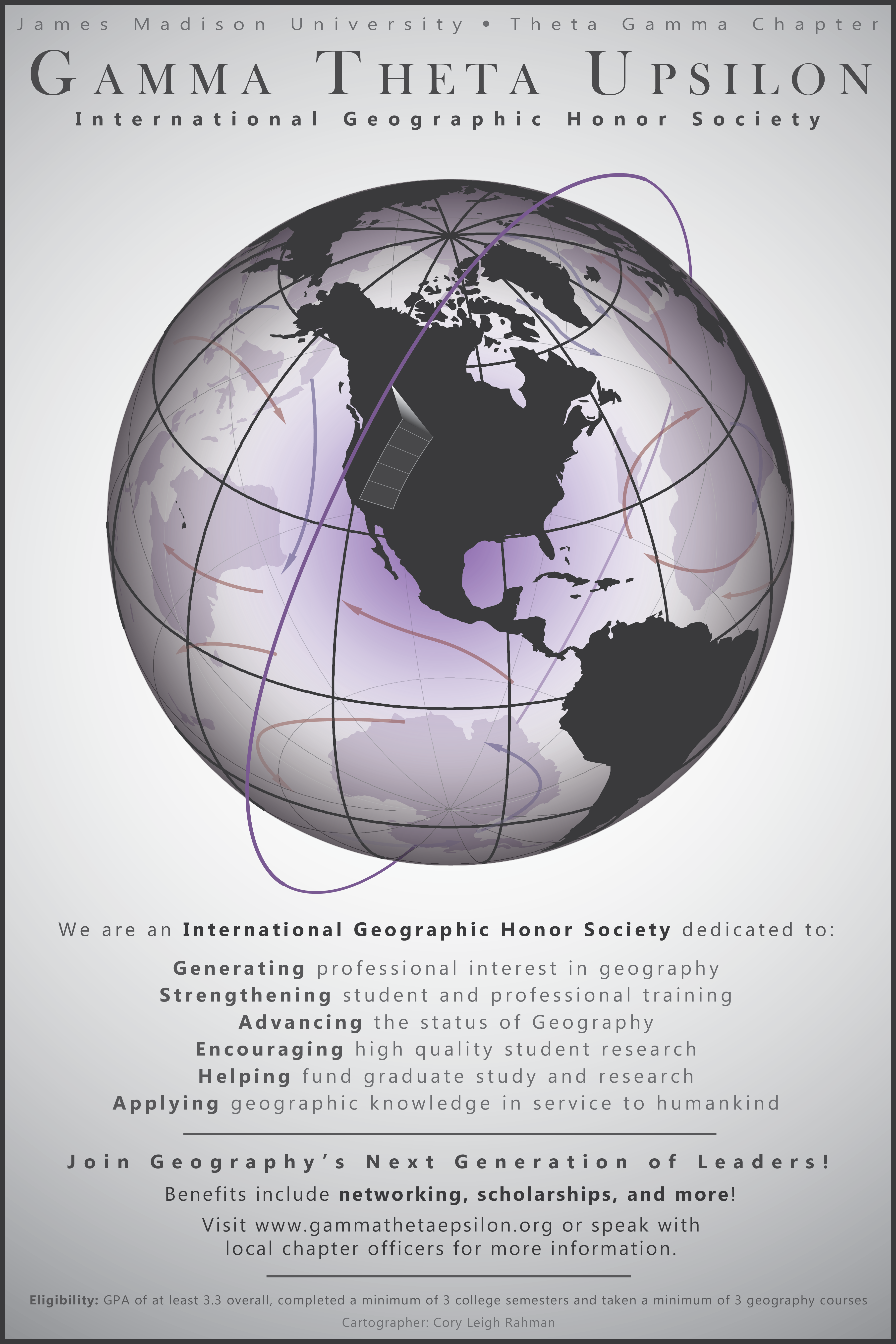
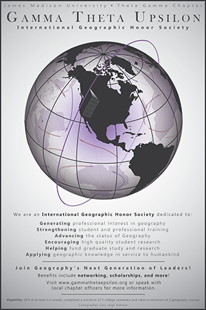
This is a poster designed for use by Gamma Theta Upsilon, an international Geographic Honors Fraternity. As president of my school's chapter I decided we needed an attention-grabbing poster to hang up in our GIS lab; as a result, this poster was born. To create the globe, I designed two custom orthographic projections in ArcGIS, one centered on southern North America and the other centered on the exact opposite side of the earth. One became the front of the globe, and the other became the back. I brought them into Adobe Illustrator and stylized the rest. The red and blue arrows represent ocean current, while the purple ring around the earth represents a Remote Sensing satellite.
Click or tap anywhere to close.
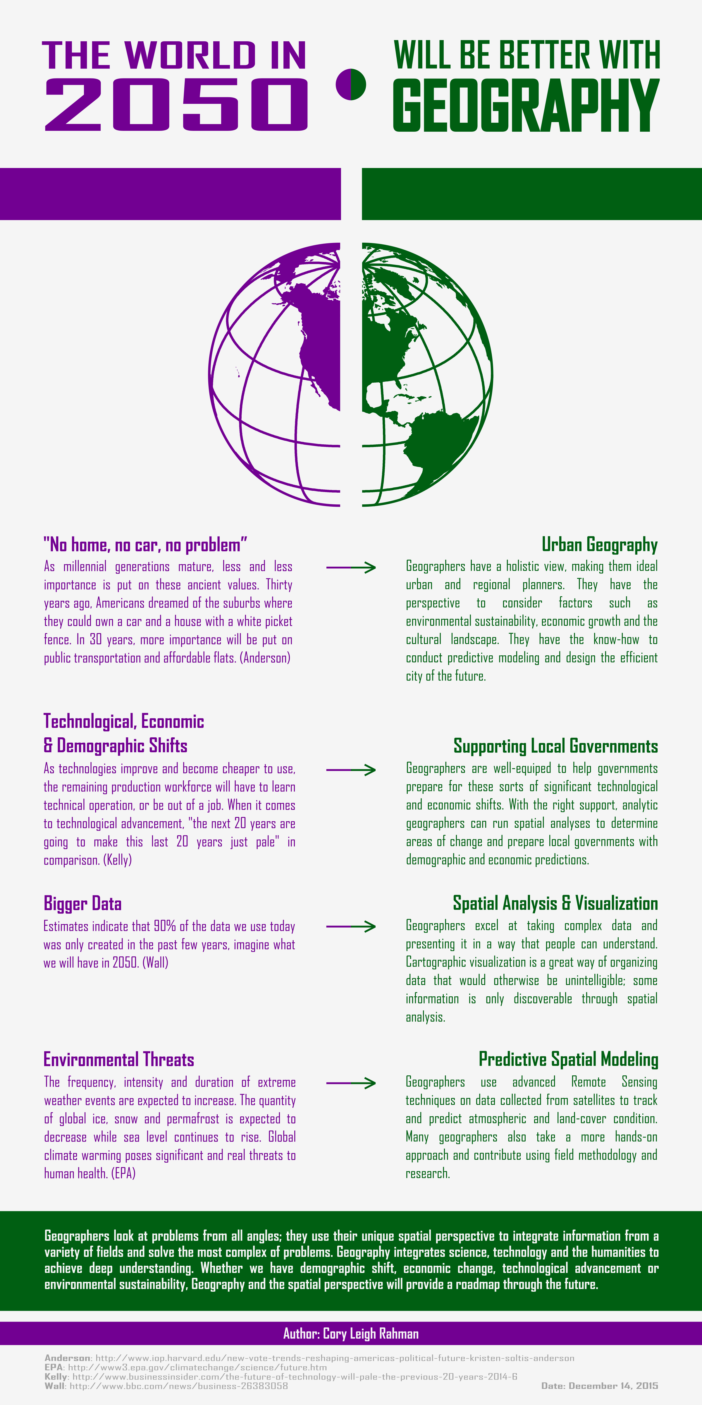
This infographic was created in order to show some future applications of Geography. On the left are a few expert predictions about the year 2050, while on the right we have corresponding skills that Geographers can use to help.
Click or tap anywhere to close.

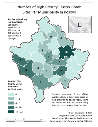
A hierarchy system was used to rate the priority of cluster bomb sites (CBS's) in Kosovo. Each site was given a certain number of priority points for being close to areas such as towns or roads, then the sites with the highest amount of priority points were counted and displayed by municipality. This map shows us that cluster bomb removal efforts should focus on the Pristina municipality first.
Click or tap anywhere to close.
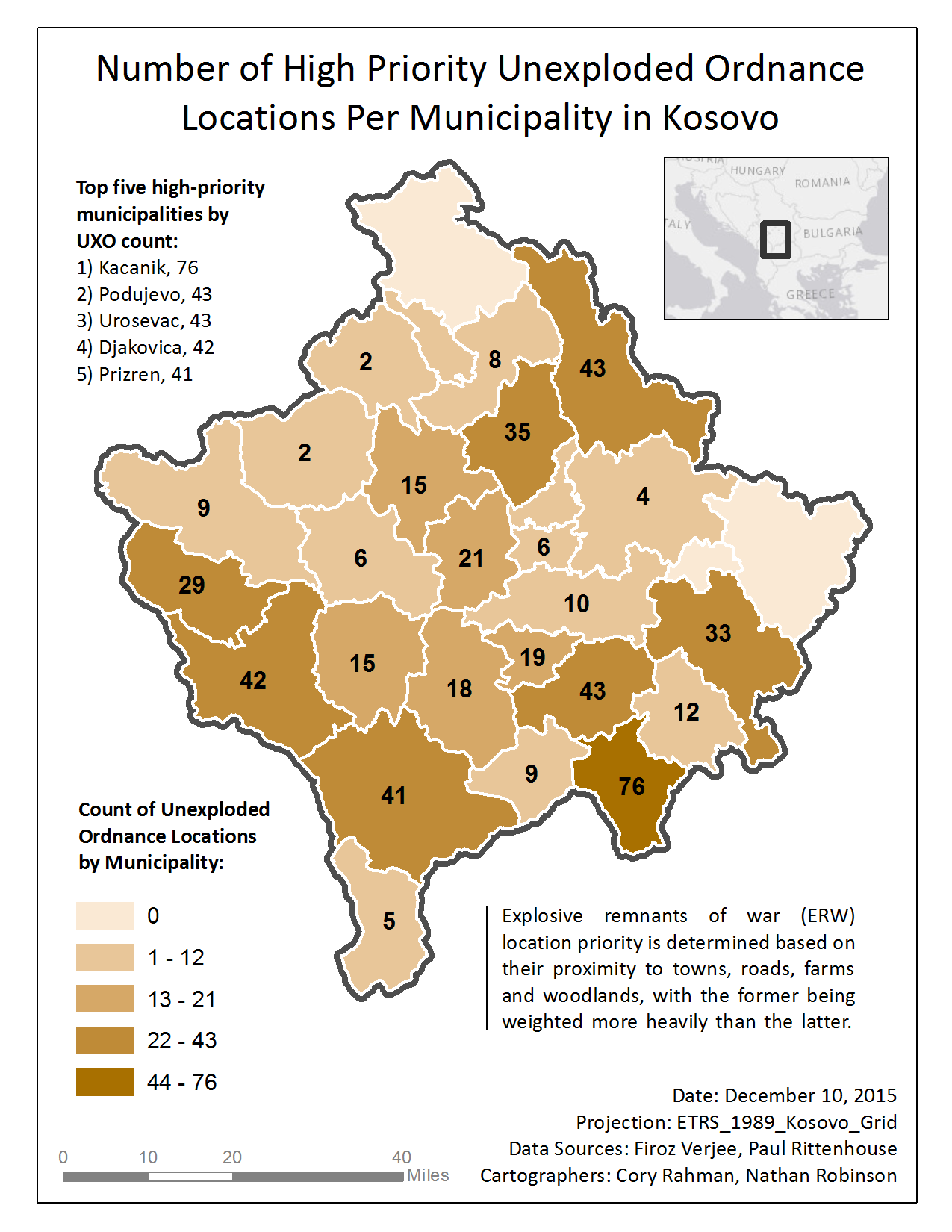
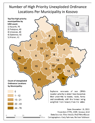
A hierarchy system was used to rate the priority of unexploded ordnance locations (UXO's) in Kosovo. Each site was given a certain number of priority points for being close to areas such as towns or roads, then the locations with the highest amount of priority points were counted and displayed by municipality. This map shows us that explosive ordnance removal efforts should focus on the Kacanik municipality first.
Click or tap anywhere to close.
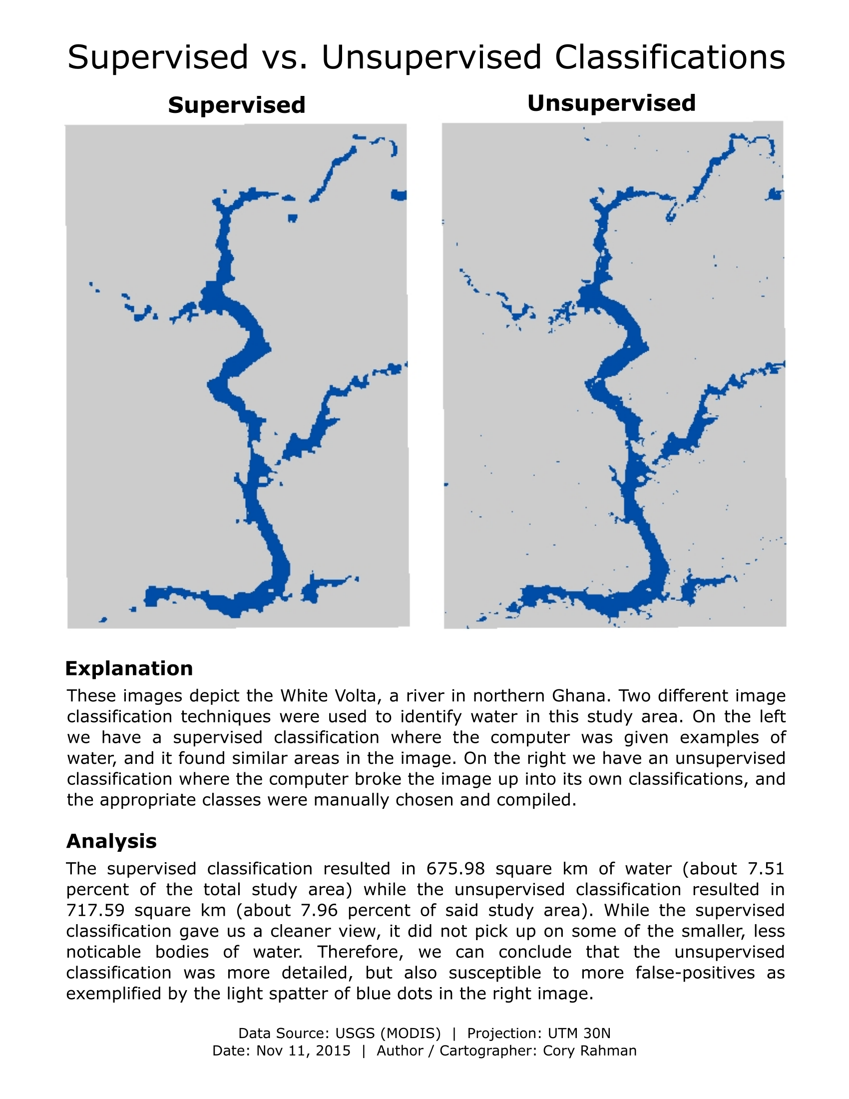
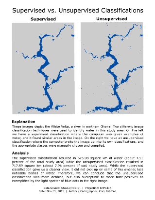
This project was a quick comparison of using Supervised vs. Unsupervised classification methods to identify features on the ground. In this case, we were attempting to identify water near the White Volta, a river in northern Ghana.
Click or tap anywhere to close.
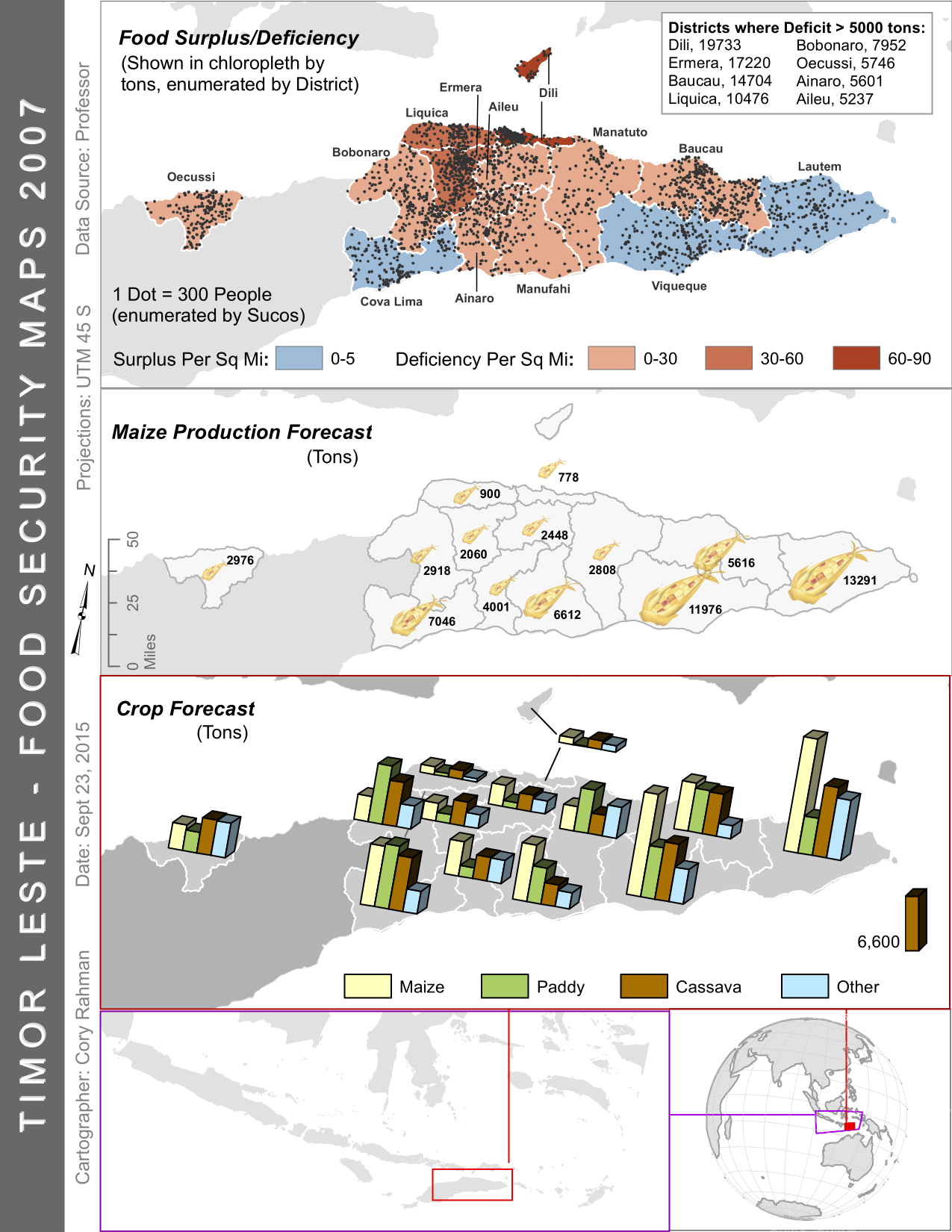
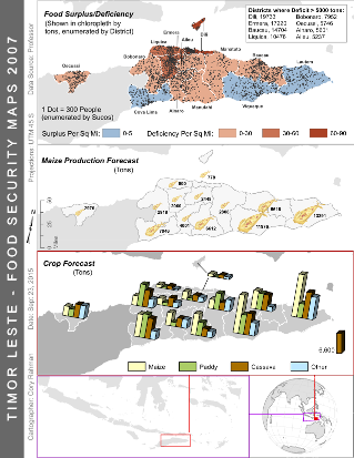
This map compares different food metrics for Timor Leste. There seems to be a strong negative correlation between the amount of food grown and the food deficiency of a region. Perhaps the food is not being distributed well enough, or the population centers are too poor to import their food from across the country.
Click or tap anywhere to close.
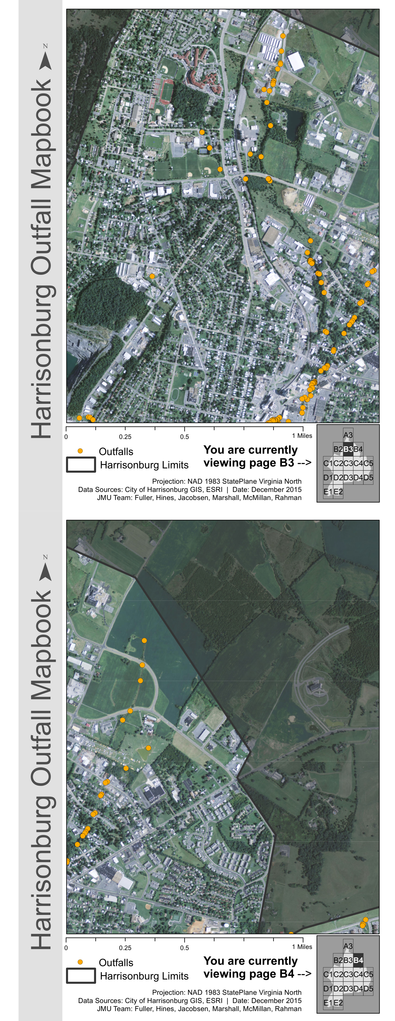
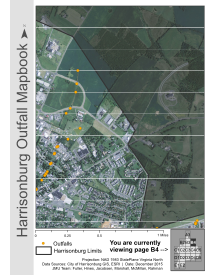
These are two pages of a streamwater Outfall mapbook for Harrisonburg, VA. The mapbook consists of 16 pages, each page showing a different section of the city. The guide in the bottom right shows which division you are currently looking at, as well as the page number for quick reference.
Click or tap anywhere to close.
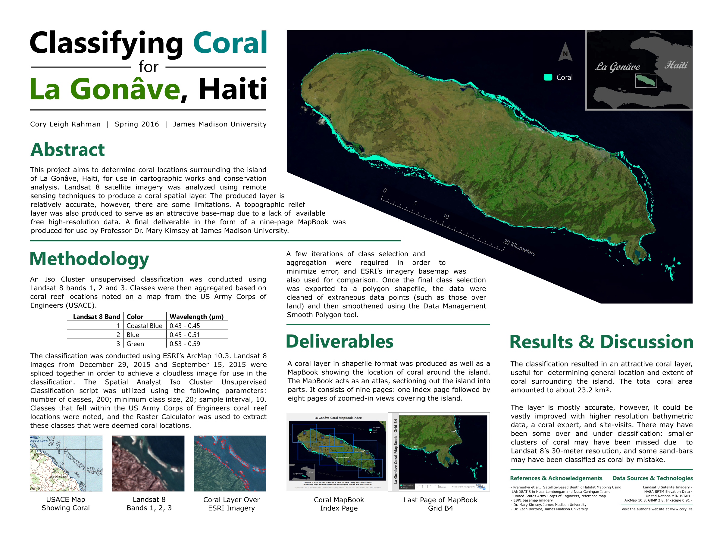
First place winner of the 2016 Geospatial Technology Awards, given by James Madison University's Geospatial Technology Steering Committee (JMU GTSC). The poster describes in detail the process I took to create an up-to-date coral reef spatial layer for the Island of La Gonave.
Click or tap anywhere to close.
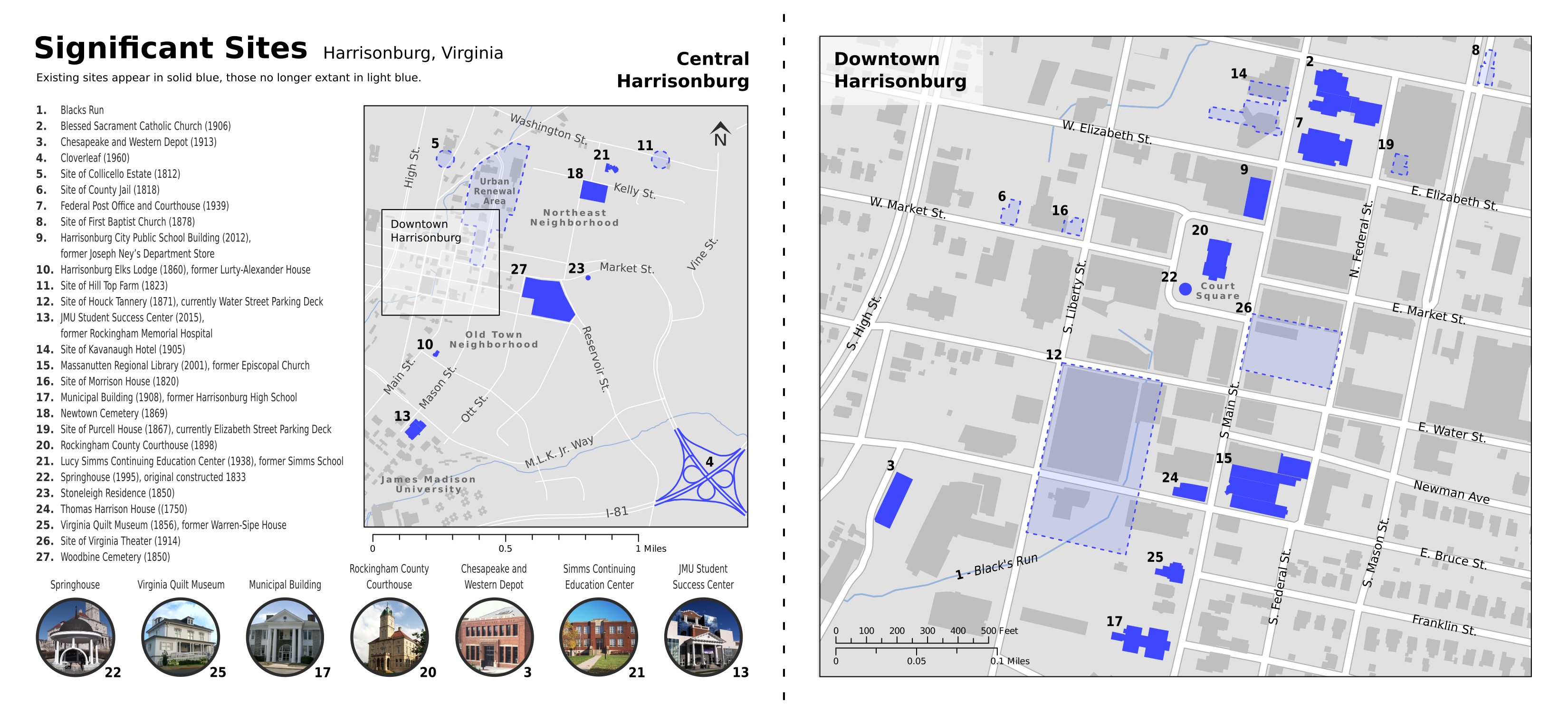
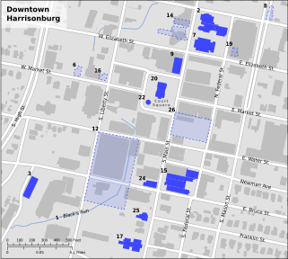
This map was produced for JMU Professors David Ehrenpreis and Henry Way for their historical nonfiction book about Harrisonburg, Virginia. The map compares current-day building locations with historic, destroyed places of significance traced from historic sources such as the Sanborn Fire Maps.
x